Burnt orange and brown aren’t colors most homeowners think to pair together, but they’re a powerhouse combination that’s having a major moment in interior design. This color scheme taps into a cozy, earthy aesthetic that feels both sophisticated and lived-in, perfect for creating a living room that actually functions as a gathering space rather than a showroom. The warm undertones in both hues complement each other naturally, creating visual depth without competing for attention. Whether you’re renovating an entire room or refreshing key pieces, this guide walks you through selecting colors, choosing furniture, layering textiles, and lighting your space so it feels genuinely inviting.
Table of Contents
ToggleKey Takeaways
- Burnt orange and brown living room decor works because both colors share warm undertones and complement each other naturally, creating visual depth without overwhelming the space.
- Use a 60-30-10 color ratio with brown as your dominant color, burnt orange as an accent, and neutral or jewel-tone accents to balance the warm palette.
- Layer textiles through throw blankets, pillows, and rugs in varying colors, patterns, and textures—mixing fiber types like linen, cotton, and wool adds sophistication and coziness.
- Select warm white lighting bulbs (2700K) and layer multiple light sources including overhead fixtures, table lamps, and dimmers to prevent the room from feeling too dark or muddy.
- Anchor the room with brown leather furniture or warm-toned upholstery, then add burnt orange accent pieces like chairs or ottomans to create an inviting, conversation-friendly gathering space.
- Burnt orange and brown remain timeless design choices unlikely to feel dated because they’re rooted in natural materials and earthy aesthetics rather than fleeting trends.
Why Burnt Orange And Brown Work Together
Burnt orange sits at the intersection of red and yellow on the color wheel, bringing warmth without the aggression of a true red. Brown, the ultimate neutral, acts as an anchor, it grounds the space and prevents the orange from overwhelming the room. Together, they create a color story rooted in earth tones and natural materials: think clay pottery, terracotta, leather, wood grain, and autumn foliage.
The key to this pairing is understanding undertones. Warm browns (those leaning toward tan, caramel, or cognac) pair seamlessly with burnt orange because they share similar warm undertones. Cool-toned browns or grayish browns would clash with burnt orange’s warmth and should be avoided. When you look at existing elements in your living room, wood flooring, existing furniture, trim, identify whether they’re warm or cool before committing to the palette.
This combination also works because both colors have excellent staying power in design trends. Unlike trendy coral-pink or millennial sage, burnt orange and brown have been quietly popular in home design for years. They’re less likely to feel dated in five years.
Color Palettes: Complementary Tones That Balance Warm Hues
Start by deciding which color anchors your space. Most designers recommend making brown the dominant color, as wall paint, large furniture pieces, or flooring, and using burnt orange as an accent through smaller pieces, accent walls, or textiles. A typical ratio is 60% brown, 30% burnt orange, and 10% accent colors.
For wall color, warm taupe, soft tan, or a muted chocolate brown work beautifully. If you prefer a statement, a single accent wall in burnt orange, perhaps behind a sofa or above a fireplace, draws the eye without overwhelming the room. Paint coverage varies by surface and sheen, but expect to need roughly 1 gallon per 400 square feet for a standard interior paint on already-primed walls. Always primer-seal new drywall or previously painted surfaces to ensure even coverage and true color.
Accent Colors To Enhance Your Scheme
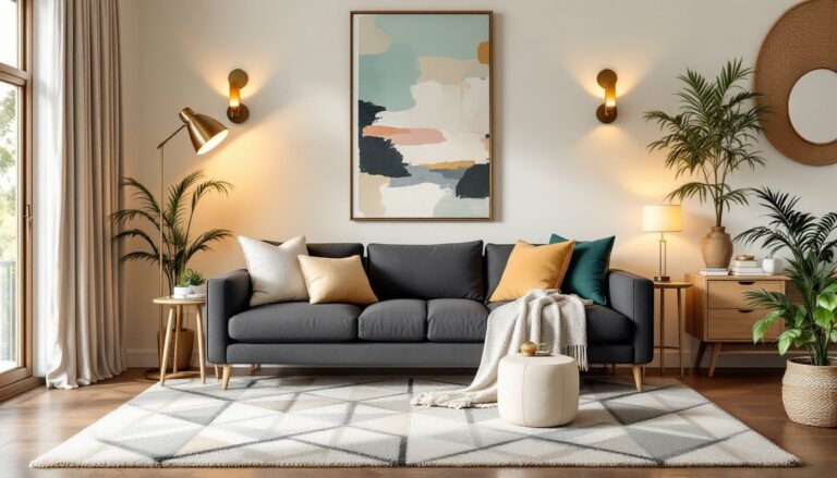
Neutral accents like cream, ivory, or warm white provide breathing room and prevent the space from feeling too dark or heavy. Cream-colored throw pillows, curtains, or a light upholstered chair break up the warm tones. Jewel tones also complement this palette: deep teal, forest green, or rich plum add sophistication and visual interest without clashing. A small amount of deep charcoal or black, in picture frames, hardware, or trim, adds contrast and prevents the room from feeling too soft.
Gold and brass metallics are ideal for hardware and light fixtures in this scheme. They echo the warm undertones already present. Avoid silver or chrome, which can feel cool and out of place against burnt orange and brown.
Furniture Selection And Layout Ideas
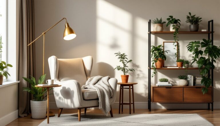
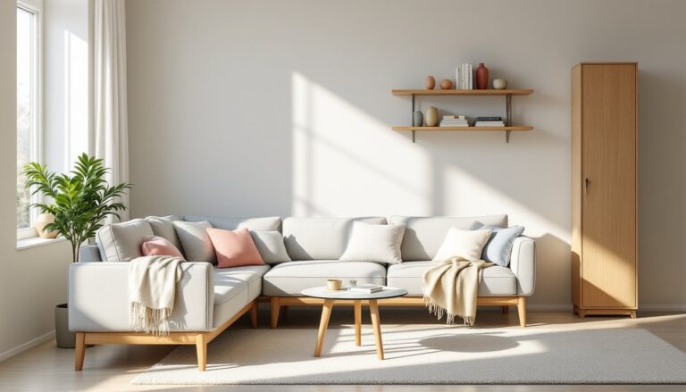
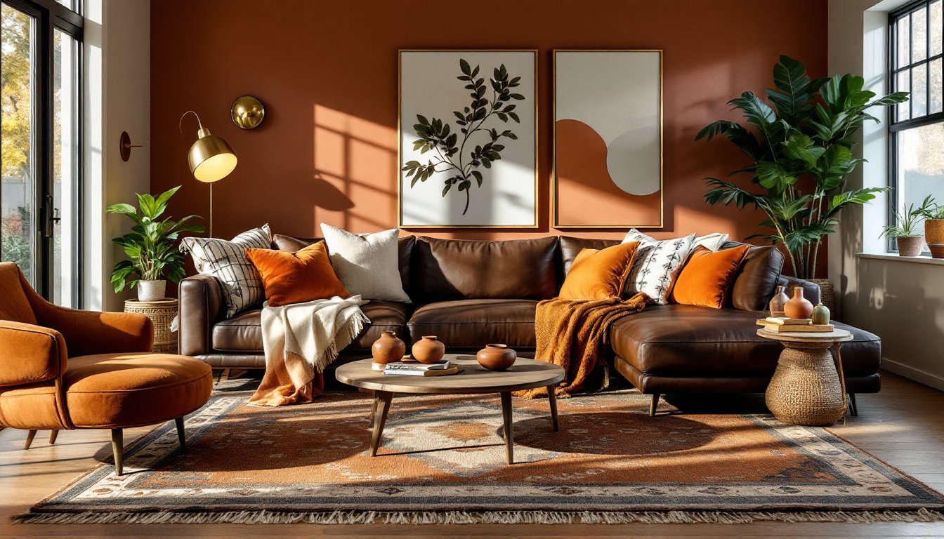
When selecting furniture, think in layers and tones rather than matching sets. A brown leather sofa or sectional anchors the room, leather develops a beautiful patina over time and aligns perfectly with this earthy aesthetic. If leather isn’t in the budget, look for upholstery in warm taupe, oatmeal, or caramel-colored fabrics. A burnt orange accent chair or ottoman adds a pop without committing the entire seating arrangement to one bold color.
Wood furniture reinforces the warm, natural vibe. Medium to dark wood coffee tables, side tables, and entertainment centers work beautifully. Avoid overly light or blonde woods, which can feel disconnected from the palette. Chocolate brown decorating ideas showcase how rich brown tones pair with warm accents for cosy, sophisticated spaces, a useful reference when sourcing pieces.
Layout matters as much as color selection. Arrange seating so people face each other, this encourages conversation and makes the space feel intentional rather than formal. A large area rug in brown, tan, or burnt orange (or a combination) anchors the seating area and adds texture. Leave at least 12 inches of flooring visible on all sides of the rug to maintain visual balance.
Textiles, Rugs, And Layering For Coziness
Textiles are where this color scheme gets its soul. Layer throw blankets in cream, burnt orange, and rust tones across your sofa and chairs. Linen, cotton, and wool all work, each brings different texture and weight. A chunky knit throw in cream feels completely different from a lightweight linen one in burnt orange, so mixing fiber types adds depth.
Throw pillows are your easiest refresh tool. Aim for a mix of colors, patterns, and textures: a burnt orange solid, a brown geometric pattern, a cream stripe, and perhaps a patterned pillow featuring multiple colors. Vary pillow sizes, some 20-inch square, some 14-inch, some lumbar, so the arrangement doesn’t look overly designed. Patterns like ikat, moroccan, or geometric designs pull together multiple colors in the palette.
For rugs, natural materials feel right in this space. Jute, sisal, or wool rugs in warm tones add tactile comfort. If you prefer patterned rugs, kilims and Turkish rugs often feature burnt orange and brown naturally. Make sure rug pads underneath prevent slipping, safety and floor protection matter. Interior design tips from MyDomaine offer room-by-room styling guidance and texture layering techniques that apply directly to building this warm aesthetic.
Lighting And Wall Treatments
Lighting can make or break this color scheme. Warm white bulbs (around 2700K color temperature) enhance the burnt orange and brown palette, while cooler daylight bulbs (5000K+) can make these warm tones look muddy. When replacing bulbs, check the kelvin rating on the package, warmer is better here.
Layer lighting with a mix of sources: overhead fixtures, table lamps, and wall sconces. A dimmer switch on overhead lights lets you adjust mood and prevent the space from feeling cave-like in the evening. Brass or gold-finished lamp bases and fixtures reinforce the warm aesthetic.
Wall treatments beyond paint add texture and interest. Shiplap, wood paneling, or accent wallpaper in subtle patterns (think a muted geometric or a warm botanical print) break up solid-color walls. If you’re installing shiplap or paneling, factor in humidity and seasonal wood movement, this is structural, not cosmetic, so ensure your installation accounts for gaps and expansion. Artwork, framed prints, paintings, or photographs, should complement the palette. Earth-toned frames in wood or gold work: black or white frames also provide contrast. Domino’s modern home decor trends highlight affordable decorating strategies and design inspiration that aligns with warm, layered aesthetics like this one.
Conclusion
A burnt orange and brown living room succeeds because it feels intentional, warm, and grounded in natural materials. The secret isn’t following rules rigidly, it’s understanding why these colors work together and letting that guide your choices. Start with brown as your anchor, add burnt orange strategically, and use creams and jewel tones to balance the warmth. Layer textiles, choose warm-toned lighting, and arrange furniture for genuine comfort. The result is a space that invites people to sit down, stay awhile, and actually live in your home.