Dark grey has become the go-to neutral for homeowners seeking a sophisticated, practical living room that doesn’t feel cold or corporate. Unlike stark white or beige, dark grey living room ideas offer depth, warmth (depending on undertone), and the flexibility to work with virtually any accent color or style, from mid-century modern to farmhouse to contemporary. The trend isn’t just aesthetic: darker walls and furnishings hide dust, scuffs, and wear far better than light neutrals, making them ideal for families and real-world living. This guide walks through the fundamentals of dark grey design, from choosing the right shade to lighting and furniture pairings that make the space feel inviting rather than cave-like.
Table of Contents
ToggleKey Takeaways
- Dark grey living room ideas provide sophisticated neutral backdrops that hide dust and wear while maintaining warmth and design flexibility with any accent color or style.
- Choose dark grey shades with undertones carefully by sampling paint chips for 3–5 days under natural light, as cool undertones suit contemporary styles while warm undertones complement farmhouse and transitional settings.
- Layered lighting with at least three sources (ambient, task, and accent) is essential to prevent dark grey rooms from feeling dingy or cave-like.
- Pair dark grey walls with light upholstered pieces, natural wood furniture, and brass or gold metals to create visual contrast and warmth without competing finishes.
- Jewel tones, textured fabrics, and mirrors are effective for adding personality and depth while keeping dark grey as a cohesive, intentional design statement.
- Start with a single feature wall rather than painting all four walls at once to test the shade and reduce initial cost before full commitment.
Why Dark Grey Works for Modern Living Rooms
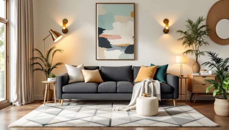
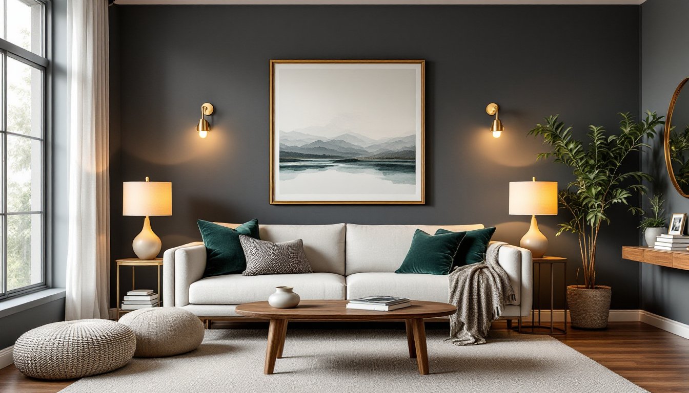
Dark grey serves as a sophisticated backdrop that anchors a room without the harshness of black or the coldness of pure white. It reads as neutral yet intentional, a deliberate design choice rather than a default. Because it sits comfortably between extremes, dark grey accommodates bold accents (jewel tones, warm metallics, natural wood) without competing. It also performs well in spaces with varied natural light: east-facing rooms benefit from the cooler morning sun, while west-facing rooms can embrace the warmth of afternoon light on grey surfaces.
From a practical standpoint, dark grey is forgiving. Pet paw prints, dust, and minor scuffs blend into the surface rather than screaming for attention. It’s why commercial spaces and high-traffic homes favor it. Yet dark grey isn’t just utilitarian, it conveys calm and confidence. It allows artwork, furnishings, and personal touches to become the focal points instead of the walls themselves. When done right, a dark grey living room feels like a deliberate design statement, not a compromise.
Choosing the Right Shade of Dark Grey
The devil is in the undertone. A dark grey that looks sophisticated on a paint chip at the store can feel oppressive or sickly at home, depending on lighting and what surrounds it. True dark greys typically range from 35–50% reflective value (LRV) on the Benjamin Moore or Sherwin-Williams scale: anything below 30% LRV edges toward charcoal. Start by sampling at least three paint chips on your walls and observe them at different times of day. Morning, afternoon, and evening light will reveal undertone shifts you won’t see under store fluorescents.
Before committing, paint a 2-by-2 foot test square on each wall (or at least the wall opposite your main window). Leave samples up for 3–5 days. Look at the color near your furniture, rugs, and artwork. This prevents the common DIY mistake of choosing a sample that photographs well but clashes with existing decor in person.
Cool vs. Warm Grey Undertones
Cool greys contain subtle blue or green undertones and pair well with contemporary, Scandinavian, and industrial styles. They can feel slightly crisp, especially in north-facing rooms with limited warm sunlight. Warm greys lean toward beige, taupe, or soft brown undertones and work beautifully in transitional and farmhouse settings. They’re more forgiving if your home has golden or warm wood tones.
If you’re unsure, ask a paint specialist to hold your furniture samples (wood grain, fabric colors) next to the grey chip under different lighting. Many hardware stores now offer virtual color-matching tools and consultation services, worth using before you buy five gallons of the wrong shade.
Lighting Strategies for Dark Grey Spaces
This is non-negotiable: dark walls require thoughtful lighting, or the room will feel dingy. Dark grey doesn’t generate or reflect light the way lighter neutrals do, so layering light sources prevents that cave effect. Aim for at least three types: ambient (ceiling fixture or recessed lights), task (reading lamps, wall sconces), and accent (floor lamps, LED strips highlighting artwork).
Ambient lighting should distribute evenly. Recessed ceiling lights work well, as do semi-flush fixtures that bounce light upward and outward. Avoid single central fixtures that create pools of shadow. Color temperature matters: warm white bulbs (2700K) complement dark grey and prevent a sterile, institutional feel. Cool white (4000K or higher) works if your grey has blue undertones and you’re going for a modern vibe, but test first.
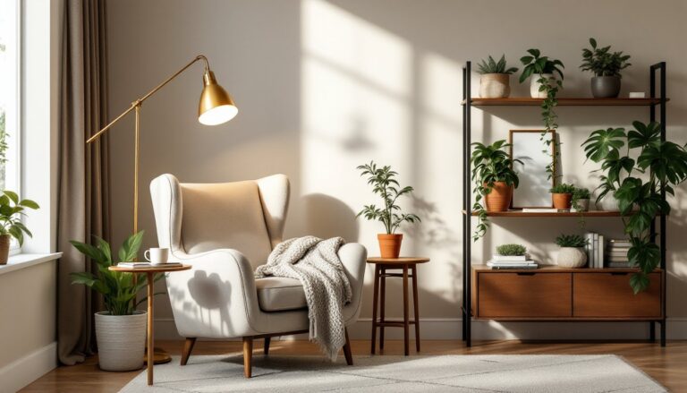
Add task lighting near seating. A pair of table lamps on side tables flanking a sofa, or a swing-arm wall sconce behind a reading chair, lets occupants adjust light without harsh overhead glare. Floor lamps with a light-colored shade (white, cream, linen) serve double duty, they provide light and act as visual anchors that break up dark surfaces. Layer in accent lighting using picture lights above artwork or LED strip lighting along shelving: this adds dimension and prevents visual flatness. The cumulative effect should feel warm and intentional, not like an interrogation room.
Furniture and Accent Colors That Complement Dark Grey
Dark grey serves as a neutral canvas, so the real magic happens with furniture and accent choices. Natural wood, walnut, oak, or cherry, creates warmth against grey and is a fail-safe pairing. Lighter woods like ash or whitewashed oak add modern contrast. Metal finishes also work: brass and rose gold feel warm and contemporary, while chrome or brushed steel lean industrial. Avoid too many competing finishes: stick to two metals maximum.
Upholstered pieces should balance the room. A sofa in cream, light grey, or natural linen creates a visual break and prevents the space from feeling too dark. Alternatively, a dark sofa with a light area rug underneath can anchor the seating zone while keeping the palette cohesive. Storage pieces, bookshelves, media consoles, cabinets, benefit from being lighter than walls (white, light oak, or warm grey) so they don’t disappear into the background.
Wall art, mirrors, and textiles do the heavy lifting for personality. Mirrors bounce light and make spaces feel larger: gold or brass frames add luxury. Large-scale artwork creates a focal point and sets the emotional tone. Textiles, throw pillows, blankets, curtains, introduce color and texture without architectural commitment. The combination of interior design ideas and your personal style shapes how you deploy these elements.
Best Accent Colors and Textures
Jewel tones, deep emerald, sapphire, or teal, feel luxe against dark grey and work in contemporary, eclectic, or bohemian settings. Warm accents like mustard, rust, or terracotta suit transitional and farmhouse styles. Soft pastels (blush, sage, soft blue) create a modern, calming vibe. Black accents deepen sophistication but risk making the room feel too heavy if overused: use sparingly for trim, hardware, or accent pieces.
Texture prevents flatness. Mix matte and shiny surfaces: a velvet sofa against a linen rug, a glass coffee table with a wood base, shaggy pillows next to smooth leather. Incorporate natural materials, sisal, jute, raw wood, stone, to add warmth and tactile interest. Plants introduce color and life: both dark and light foliage work, but trailing or tall plants visually enliven dark walls. Modern home decor trends often showcase grey paired with living greenery for exactly this reason.
Practical Design Tips for Your Dark Grey Living Room
Start with one feature wall rather than committing all four walls to dark grey immediately. A single dark wall (often behind a sofa) grounds the room without overwhelming it, and you can always expand later once you’ve lived with the color. This also reduces paint cost and allows you to test the shade’s behavior before full commitment.
Consider your existing natural light. North-facing rooms with minimal direct sun suit warm greys better: they prevent the space from feeling perpetually shadowed. South or west-facing rooms can handle cooler, bluer greys because afternoon sun warms them naturally. If artificial light dominates (apartments with small windows, interior living rooms), lean toward warm grey and invest in quality ambient and task lighting upfront.
Paint quality matters. Mid-range or premium paints (Sherwin-Williams Duration, Benjamin Moore Aura) offer better coverage, durability, and color consistency than budget lines. Dark colors require two coats and sometimes a primer, especially over light or glossy surfaces. Budget an extra $50–100 per gallon for primer if switching dramatically from light to dark. Allow 48 hours of cure time before moving furniture back or assessing the final result.
Accessorize thoughtfully to avoid a sparse, showroom feel. A living room isn’t complete with just walls and furniture: home styling guides emphasize layering accessories that tell a story. Include a few meaningful pieces, a treasured book stack, a family photo ledge, a favorite plant, rather than rushing to fill every surface. This keeps the dark walls from feeling sterile while maintaining the sophisticated aesthetic you’re after. Plan a modest budget for accent pillow swaps, artwork, or lighting adjustments once the walls are painted: you’ll refine as you live in the space.