Open-concept living spaces have become the standard in modern homes, but they bring a real challenge: how do you make one large room feel cohesive without it looking like a paint showroom? The answer lies in smart color selection. When your living room and kitchen share the same visual field, the wrong color scheme can feel chaotic, while the right one creates flow, defines zones, and actually makes your space feel larger. Whether you’re planning a full renovation or a fresh coat of paint, understanding how colors work together in open-concept spaces is the difference between a project that wows and one that falls flat. Let’s walk through proven color strategies that work in real homes, not just designer magazines.
Table of Contents
ToggleKey Takeaways
- Smart color schemes for open-concept living rooms and kitchens should share either warm or cool undertones to create visual flow rather than jarring transitions between spaces.
- Neutral palettes with personality, like greige and warm whites, work beautifully in open-concept spaces—but always test colors under your home’s actual lighting conditions for 3-4 days before committing.
- Bold accent colors succeed in open-concept paint ideas when strategically applied to one wall, kitchen island, or cabinetry rather than all walls, creating intentional drama without overwhelming the space.
- Use subtle color shifts within the neutral family to define zones psychologically—signaling function between the kitchen and living room without physical dividers.
- Lighting direction and artificial bulb temperature directly impact how paint colors appear; north-facing rooms benefit from warm undertones while south-facing rooms need cool colors to balance golden light.
- Proper prep work and painting quality surfaces with appropriate finishes (satin for kitchens, eggshell for walls) is as critical as color selection for achieving a polished, cohesive open-concept space.
Understanding Open-Concept Color Flow
The key to successful color in an open-concept space is understanding that your walls, trim, and kitchen cabinetry aren’t isolated surfaces anymore, they’re part of one visual story. When you’re looking from the kitchen into the living room, your eye travels continuously across all those colors. That’s why jarring transitions between rooms feel uncomfortable, while thoughtful color progressions feel natural.
Start by thinking of color as a tool for unity rather than a divider. You don’t need the entire space painted the same color, but the colors you choose should share either an undertone family (all warm, all cool, all neutral) or a color intensity level (all muted, all saturated). A warm cream kitchen and a cool blue living room sitting side-by-side will fight each other. A warm cream kitchen and a warm taupe living room will feel like a deliberate design choice.
Consider the architecture too. If your kitchen has white cabinetry and stainless appliances, those already introduce visual contrast, so your walls should work with that, not against it. If your kitchen is darker wood or gray, the walls can be lighter to balance the space, or match in tone for a more dramatic, unified look. The living room wall color should acknowledge what’s happening in the kitchen, even if they’re not identical shades.
Neutral and Warm Palettes for Cohesion
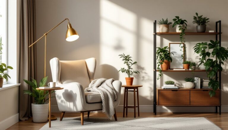
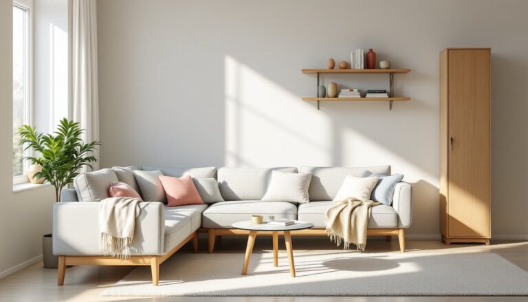
Neutral palettes remain the safest bet in open-concept spaces, and for good reason: they genuinely work. But “neutral” doesn’t mean beige boredom. Today’s neutrals come with personality, greige (gray-beige blend), warm whites with undertones of cream or soft taupe, and soft grays with warm undertones are all living in houses right now.
Warm neutrals like sherwin williams Accessible Beige or Benjamin Moore Hale Navy work beautifully because they feel inviting without shouting for attention. Pair these on walls with white or cream trim, and you create a clean backbone that lets your furnishings, kitchen hardware, and natural light do the talking. If your kitchen has white cabinetry, this approach feels seamless. If your kitchen is gray or darker, the warm neutral still provides a cohesive backdrop.
One practical tip: sample your chosen neutral on at least 2 walls before committing. Neutrals are chameleonic, they shift dramatically based on lighting direction, time of day, and the colors around them. A neutral that looks perfect at noon might feel too warm or too cool at 6 PM when artificial light kicks in. Paint large swatches and live with them for 3-4 days, observing morning light, afternoon light, and evening light. This step separates successful projects from regretful ones. Resources like budget home makeovers on design blogs showcase how neutral palettes anchor entire open-concept spaces.
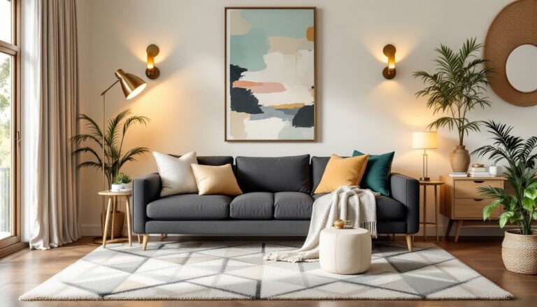
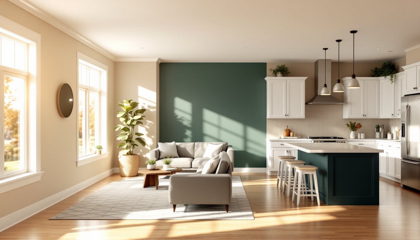
Bold Accent Colors That Transform Your Space
If a neutral backbone feels too safe for your taste, bold accent colors can energize an open-concept space, if you’re strategic. The trick is using bold color in a way that feels intentional, not chaotic. Instead of painting all walls a saturated color, commit one wall or one architectural feature (like an island or kitchen peninsula) to your bold choice.
Deep greens (forest, sage, hunter), warm terracottas, and navy blues are trending in 2026 because they feel sophisticated rather than juvenile. A deep green accent wall behind your living room sofa, paired with warm white or cream walls throughout, creates drama without sacrifice flow. The kitchen, visible from the living room, stays neutral, so the bold color feels like a design choice rather than an accident.
Another approach: use bold color on cabinetry or kitchen islands instead of walls. A deep blue or forest green kitchen island against white walls and warm neutral kitchen walls creates a focal point that pulls the room together. This is less risky than bold wall paint, you can update cabinetry color with paint or stain later. If you’re painting cabinetry, use quality kitchen-grade primers and paints: standard interior paint won’t hold up to the splashes and heat near cooking surfaces. Projects featured on Young House Love frequently demonstrate how accent colors anchor open spaces without overwhelming them.
Creating Visual Zones With Strategic Color Use
One of the smartest moves in open-concept design is using subtle color shifts to define zones without walls. You’re not dividing the space, you’re signaling function and creating psychological separation. The living room might be a slightly different shade or tone than the kitchen, even though both are in the neutral family.
For example, if your kitchen is Sherwin Williams Pure White, your living room might be Accessible Beige or Urbane Bronze. The difference is subtle enough to maintain flow, but distinct enough that people unconsciously understand they’re in different zones. This works particularly well when combined with flooring changes: tile in the kitchen, wood or different-finish in the living room. The color shift reinforces that transition.
You can also use color to highlight architectural features that naturally define zones. If your kitchen peninsula is a focal point, painting it a slightly deeper or contrasting shade acknowledges its function as a divider. If your living room has a fireplace, a slightly warmer or cooler accent color around that wall signals importance. The key is restraint, avoid the temptation to make every feature different. One or two strategic color zones feel intentional: five feel confused.
Lighting Considerations for Paint Selection
Before you buy a single gallon, understand your home’s light. The most beautiful paint color in the world looks wrong under the wrong lighting. North-facing rooms are naturally cooler, so cool colors can feel cold and colors with warm undertones work better. South-facing rooms get warm, golden light, which can make warm colors feel overwhelming, cool colors balance them out. East and west-facing rooms shift throughout the day, so pick colors that work in multiple light conditions.
Beyond natural light, artificial lighting matters enormously. LED bulbs are standard now, but color temperature varies. Warm white LEDs (2700K) enhance warm neutrals and warm colors. Cool white (5000K+) can make warm colors feel yellow and muddy. If you’re planning to use warm neutrals or warm accent colors, choose warm white LED bulbs. If you’re planning cool colors, you can go slightly cooler with your bulbs without making the space feel sterile.
Here’s a practical step: before painting, install the lighting you plan to use, or at least the bulbs and fixtures, and observe your paint swatches under those conditions. Artificial light in a paint store is not the same as the light in your living room. This 15-minute investment prevents a catastrophic color disappointment.
Practical Tips for Testing and Committing to Your Color Scheme
Testing paint before commitment is non-negotiable. Don’t rely on the paint chip or the color on a computer screen. Buy a quart or sample size of any color you’re seriously considering and paint a 2-by-3-foot section on the wall where that color will live. Observe it under different lighting conditions for at least three days.
When testing, paint around existing features, your cabinet color, appliances, flooring. The color will appear different against a white test wall than it will against your actual surroundings. If you’re testing multiple colors, space them far enough apart (at least 2 feet) so they don’t influence each other visually. Step back frequently and view them from different angles and distances. What looks perfect close up might feel off from across the room.
Once you’ve settled on your color, buy all your paint at once from the same batch. Paint manufacturers mix in batches, and slight variations between batches are invisible on a store shelf but noticeable on your walls. Use a quality paint appropriate to the surface: semi-gloss or satin for trim and kitchens, eggshell or satin for walls. Flat or matte finishes show every fingerprint in kitchens, avoid them there. Prep work matters just as much as the paint itself. Clean walls thoroughly, fill holes, sand glossy surfaces, and use a primer on stains or color changes. Skipping these steps doesn’t save time: it just guarantees you’ll notice flaws every time you look at your walls. Interior design inspiration across luxury homes and renovations demonstrates how proper prep and color selection work together to create polished, cohesive spaces.
Conclusion
Color in open-concept spaces isn’t about matching everything or playing it safe with beige. It’s about understanding how colors interact, respecting your home’s natural and artificial light, and making intentional choices that feel cohesive. Test thoroughly, commit thoughtfully, and don’t be afraid of subtle boldness. The payoff is a living and kitchen space that flows visually, defines function through color, and looks genuinely intentional rather than generic.