Black and white wall decor is a timeless choice that works harder than most homeowners realize. Rather than feeling sterile or cold, a well-executed monochrome scheme creates visual impact, makes rooms feel larger, and adapts to nearly any furniture or accent color. Whether a homeowner is starting from scratch or refreshing an existing living room, black and white walls offer flexibility, they can go minimalist and serene or bold and graphic. The key is understanding how to layer these contrasts without overwhelming the space. This guide walks through seven proven design approaches, from gallery walls to statement wallpapers, with practical installation tips that any DIYer can execute.
Table of Contents
ToggleKey Takeaways
- Black and white wall decor creates visual impact and makes rooms feel larger without clashing with furniture or accent colors, making it a timeless and strategic choice for living rooms.
- Gallery walls are the most forgiving approach to incorporating black and white designs—lay out frames on the floor first, maintain 2–3 inches of spacing, and use a level to prevent crooked artwork.
- Statement wallpapers in geometric patterns require thorough wall prep (cleaning, sanding, and priming) before installation; peel-and-stick options offer a renter-friendly alternative for DIYers.
- An accent wall painted in deep black or charcoal positioned opposite the main seating area provides visual direction without the commitment of covering the entire room.
- Premium interior paint, proper primer application (two coats for dark colors), and correct hardware (toggle bolts for artwork under 20 lbs, studs for heavier pieces) ensure professional, lasting results.
- Textured finishes and wall art installations add dimension and visual interest to monochrome schemes, while regular maintenance with damp microfiber cloths preserves the finish quality over time.
Why Black And White Works For Living Room Walls
Black and white isn’t just safe, it’s strategic. These colors have zero undertones and won’t clash with art, furniture, or lighting changes down the road. A living room is where a household lives daily, so walls that don’t age out or demand repainting every season pay dividends.
Black absorbs light and adds depth: white reflects it and opens up the room. Together, they create contrast without relying on loud hues. This contrast naturally draws the eye to focal points, a window, a fireplace, or a piece of art.
Another practical advantage: black and white photographs well. If a homeowner ever wants to showcase their living room online or simply enjoy photos of the space, monochrome walls let the real stars (furniture, art, people) shine. Materials like matte and glossy finishes also work well in these tones. A matte black wall feels sophisticated: a satin white wall reflects light subtly without glare.
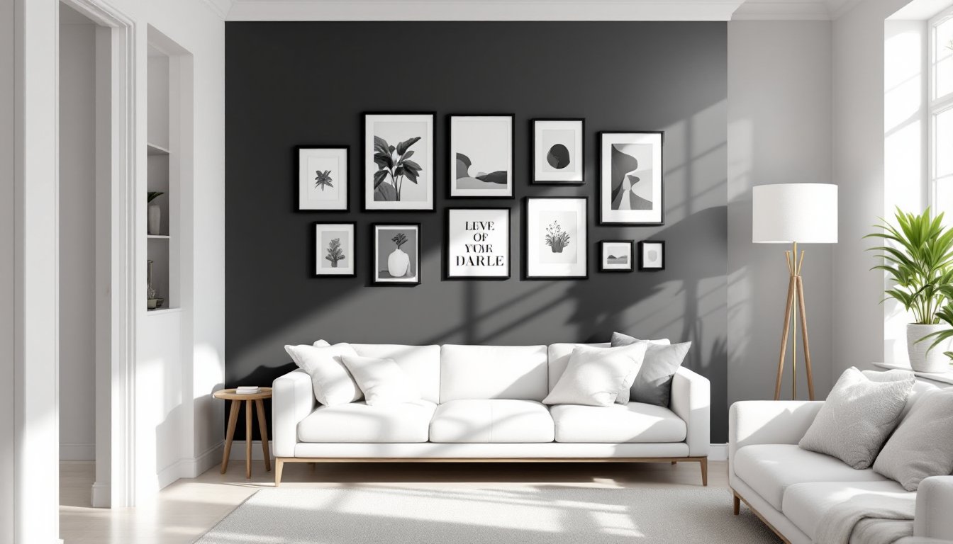
Gallery Walls: Creating Impact With Mixed Artwork
A gallery wall is one of the highest-impact, least-permanent ways to bring black and white into a living room. Unlike painting, hanging artwork is forgiving, frames can be repositioned, swapped, or removed entirely.
The magic is in curation. A mix of different frame sizes, mat colors, and artwork styles (photographs, prints, sketches, posters) creates visual rhythm. Black frames on a white wall, white frames on a black wall, or mixed frames throughout all work. The art itself matters more than uniformity.
Consider incorporating a mix of textures and mediums: black-and-white photography, abstract prints, typography, and even textured canvas pieces. When pulling this together, think about the room’s lighting. Natural light from windows will affect how whites read: overhead lighting might shift warm or cool tones slightly.
Gallery walls require zero renovation skills but demand planning. Rushing the layout typically results in lopsided, regrettable arrangements. Before hammering a single nail, lay out frames on the floor first and take a photo. This prevents drift.
Planning Your Layout And Spacing
Measure the wall space first. Standard living room walls are 10–12 feet wide: a gallery wall typically works best spanning 4–6 feet to avoid looking scattered. For spacing between frames, maintain 2–3 inches of consistency: it’s tighter and more intentional than random gaps.
When hanging, find studs where possible using a stud finder or knock test. If hanging on drywall without studs, use appropriate anchors rated for the frame weight, hollow wall anchors handle lighter pieces (under 10 lbs), toggle bolts work for heavier work. Drywall anchors must support the combined weight of frame and glass.
Use a level on the first frame, then measure down and over for each subsequent frame using a tape measure and pencil marks. A laser level accelerates this step significantly. Double-check all frames are level before stepping back, crooked artwork destroys an otherwise polished gallery wall.
Geometric Patterns And Statement Wallpapers
Wallpaper is experiencing a DIY revival, and black-and-white patterned wallpapers hit the sweet spot between bold and livable. Stripes, checks, chevrons, and abstract geometrics all read clearly in high contrast. The real work isn’t the application, it’s the prep.
Before hanging any wallpaper, walls must be clean, smooth, and properly primed. Dust, old paint drips, and uneven surfaces telegraph through wallpaper like a x-ray. Fill holes and gaps with spackling compound, sand smooth, and prime with an adhesion-promoting primer. This step can’t be rushed.
For peel-and-stick wallpapers (increasingly popular with DIYers), measure the wall height and width, buy 10% extra for pattern matching and cuts, and work in vertical strips. Start at one corner and smooth each strip with a plastic squeegee, working out air bubbles as you go. The peel-and-stick approach is slower than traditional wallpaper but friendlier to renters and those who dislike permanent installation.
Traditional wallpaper requires a paste activator, proper humidity control, and a seam roller. If the room is very dry or humid, wallpaper can shrink or wrinkle. Aim for 40–60% relative humidity. Wall prep, pattern matching, and seaming are what separate clean results from amateur-looking bubbles and misaligned patterns. For first-timers, watching video tutorials or practicing on a single wall before committing to the whole room is smart.
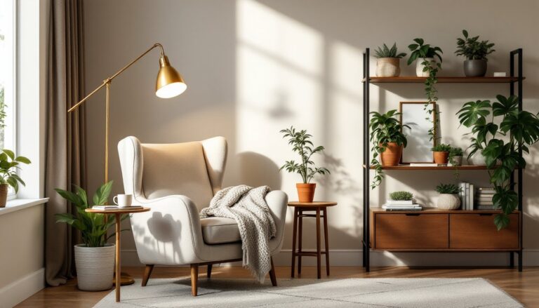
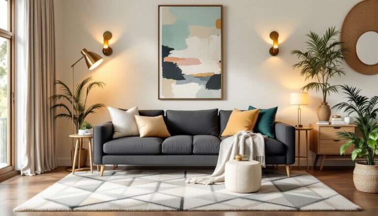
Monochrome Accent Walls: Bold And Versatile
An accent wall, one wall painted a bold or contrasting shade while the rest stay lighter, is a gentler entry point into black and white than covering an entire room. Paint one wall deep black or charcoal, keep the remaining three or two white or off-white, and suddenly the room has direction and focus.
Where to place the accent wall? Most designers suggest the wall facing the main seating area (opposite the couch or behind a fireplace). It becomes a visual anchor that anchors the room’s composition. Avoid painting a wall you see in every photo or reflection if you’re uncertain: pick one that reads as secondary at first.
Paint quality matters, premium interior acrylics (typically $40–60 per gallon) cover better, hide imperfections, and last longer than economy brands. For a single accent wall, plan on one gallon: it covers roughly 350–400 square feet depending on sheen and surface condition. Matte finishes hide imperfections but aren’t as wipeable: satin or eggshell sheens are more forgiving for high-traffic living rooms.
Don’t skimp on primer. Two primer coats are standard for dark colors going over light walls, or light colors over dark walls. Skipping primer means uneven coverage, poor color payoff, and frequent repainting. Use painter’s tape on trim and adjacent walls, apply primer and paint in thin coats (two to three coats total), and remove tape while paint is slightly tacky. This reduces the chance of paint peeling with the tape.
Textured Finishes And Wall Art Installation Tips
Texture transforms black and white from flat and graphic to dimensional and tactile. Textured wallpapers, plaster finishes, or even strategically placed wall art create visual interest that solid color alone can’t deliver. Shiplap (board-and-batten paneling), grasscloth, or faux brick can all work in black and white themes. They add shadow lines and depth.
For DIYers looking to avoid full-scale wallpaper or paint, peel-and-stick textured panels are now widely available. They attach to clean, smooth walls like contact paper and create genuine dimension without the permanence of shiplap or drywall renovation.
Textured finishes do demand more cleaning effort, dust settles in crevices and isn’t as easy to wipe as smooth surfaces. Budget extra time and a soft brush for dusting. If allergies are a concern, smooth finishes are more forgiving.
Wall art installation in black-and-white schemes is forgiving because the background is neutral. A vibrant color print, a wooden frame, or a metal sculpture all pop against monochrome. Don’t overthink it, let the art guide spacing and placement rather than forcing geometric perfection.
DIY Hanging And Maintenance
For framed art and wall installations, weight distribution is critical. Heavy frames (over 20 lbs) need studs or heavy-duty anchors. Lighter artwork can use toggle bolts rated for the combined weight of frame and contents. Always test anchors with a gentle tug before hanging.
When hanging multiple pieces, measure from floor or a fixed reference point (like the baseboard or chair rail height) rather than eyeballing. Consistency in height, typically 57–60 inches from floor to center of frame, looks intentional. Use a level or laser for accuracy.
For maintenance, wipe matte-finish walls with a slightly damp (not wet) microfiber cloth to avoid streaking. Glossy and satin finishes tolerate more aggressive cleaning. Never scrub hard or use abrasive sponges on any wall. Touch-up paint, kept in a labeled container, extends the life of painted walls, small scuffs are quick fixes.